An interview with Jean-Michel Basquiat

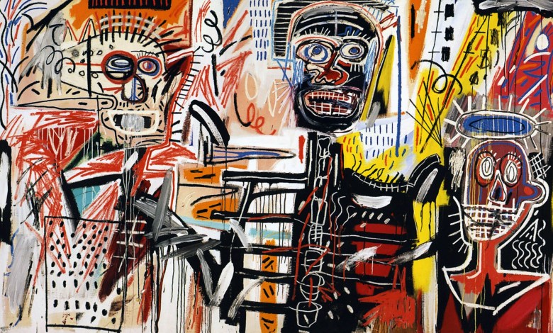
This evening, I watched an interview with artist Jean-Michel Basquiat.

ST. MORITZ, SWITZERLAND – 1983: Artist Jean-Michel paints in 1983 in St. Moritz, Switzerland. (Photo by Lee Jaffe/Getty Images)

I am not a great lover of Basquiat’s work, but it was interesting to feel a little bit more appreciation after engaging with the artists himself for 35 minutes – even though it was a rather painful 35 minutes. It was hard to tell who felt more uncomfortable through the interview, Basquiat or the interviewer.

Here are a couple moments that stuck out to me from the interview. First, the interviewer asks about a series of paintings in a show he had seen recently.

Interviewer: “Were they done for that show?”
Basquiat: “No, they – they were just done. But they weren’t done… for any reason or anything.”

Interviewer: “What do people like in your work?”
Basquiat: “You got me.”
Interviewer: “I think people are classifying you as – what? An expressionist?”
Basquiat: “Expressionist? That happened a long time ago didn’t it?”
Interviewer: “Expressionism? Yeah – well there’s New Expressionism.”
Basquiat: “Oh… expressionism. Well, art should be expressive. Of something or other.”

Interviewer: “There’s a certain – let’s use the term crudity to your heads I suppose. You like it that way? Or would you like to get them more refined in a realistic way?”
Basquiat: “I don’t – I haven’t really met that many refined people. Most people are generally crude.”
Interviewer: “And that’s why you keep your images crude?”
Basquiat: “Oh believe it or not, I can really draw.”
Interviewer: “No I believe you can really draw.”
Basquiat: “But – I.. I don’t really know. I try to fight against that usually.”

Basquiat: “I am what I am, what I am.”

Quiet, contemplative, soft spoken… I had painted a picture of Basquiat in my head, but similar to his own paintings, it seemed crude when put against the man himself captured on film.

In 2017, an untitled piece of Basquiat sold for 110 million dollars at auction. It is one of the most expensive pieces of art ever sold.

Basquiat died of a drug overdose on August 12, 1988. He was 27.

The artwork of Jason Polan

Today, this blog post from Austin Kleon introduced me to a charming new artist – Jason Polan.

Jason died on January 27, 2020.

I’d like to continue learning more about Jason, “one of the quirkiest and most prolific denizens of the New York art scene.” But from the little I know about him now, it seems like Jason is someone I’d like to be like. Ambitious, hard working, consistent.

On multiple occasions, Jason sketches every piece of artwork in the Museum of Modern Art (MoMA).


In this video, Jason said “I think there’s a quality in quantity.” I agree with him whole-heartedly.

After reading and watching a little bit about Jason, and seeing his artwork, I was inspired to go back to a past project of mine, a comic strip called Stephanie and Carl. I drew Stephanie and Carl today for the first time in many months, and hope to keep drawing them.

A work day at home

I spent the day working at my small round, white kitchen table, then the evening working on my couch. Different projects here and there – but the evening was dedicated entirely to posters and personal work (though I had not planned to work on personal poster projects for 5+ hours today).

I made another animation today! It was really fun to play around with the “squeeze” and “stretch” effect on the bun during its bounce – a key foundational aspect of 2D animation.

This week’s design challenge is a poster that incorporates an element made in a 3D software… I don’t like 3D software. I’m trying to figure out a way to blend an element of 3D with my normal 2D style, like seen in this sketch. The concept is a mailman in the 2D world very confused at this 3D package.

Thoughts?

Graphic Design in Film

A little while ago, I stumbled on a talk by the graphic designer for Wes Anderson’s animated feature, Isle of Dogs. Unfortunately, I can not find that video anymore… But it blew my mind!(here is an article on the topic instead)

Never before had I thought about the world of graphic design in the universe of the film industry, but of course it makes sense! Fictional worlds need graphic designers too.
After hearing that talk, I knew it was something I’d love to do one day – but didn’t give it much more thought.

This week, I found another talk on the subject. Ironically, it was a designer working on another Wes Anderson film, but this time it was The Grand Budapest Hotel.

The designer, Annie Atkins, talks about her experience as a designer, her accidental path into the film world, and the movies she’s worked on over the last 10 years in the industry.
She goes in depth on what it’s like to design for a film. The timeline, expectations, duties. She talks about prop making and materials, and her processes for different types of work.

One thing that stuck out to me was her thoughts on hand-made vs. machine made. If things were made by hand in the time period she is designing for, she’s determined to make them by hand now. On paper, without a keyboard or computer. If things were made with any sort of machine, though, such as a printing press, she’s okay to cheat and create them with her own machine. Much more advanced though it is.

It was a great talk, and it’s a cool career. It is now officially on my bucket list to be a graphic designer for a film one day.

Graphics day

Got into a little bit of pixel art. It’s a fun new challenge.

I made a new little avatar illustration for my Instagram account.

And look at this gorgeous old Apple add I found today! Mm, so pretty.

Lessons from Malcolm Gladwell’s masterclass

1. The ultimate question is “what is interesting?”

– Imperfection is interesting
– Failure can be interesting

2. Interesting doesn’t mean it’s clean or that the protagonist gets what they want.

3. Incomplete stories, without that final piece that wraps it up nicely, can be the stories that stick in a readers mind the longest…

4. Give your audience meat to chew on and think about, but give them candy too – funny little moments that are easy to consume and share with others.

5. Surprise vs. Suspense

– Surprise: New, revelatory information out of the blue
– Suspense: Keeping information secret that the reader knows it is missing and needs

6. Library nonfiction shelves are arranged like a conversation – categories blend into each other and teach you how to think.

7. Stories must challenge, transport or transform.

8. Use comparison and contrast of characters in and of itself to help describe and flesh out individual characters. The contrast, and how characters respond to each other is often revealing.

Gladwell’s may be my favorite class I’ve taken so far in my learning challenge. He is incredibly engaging, and teaches through his storytelling. His course is on Masterclass. I highly recommend it along with all of his books.

Places and Spaces

I’ve found recently that I have deep love for places… For scenery and spaces and views. For picturesque moments in movies that allows the viewer to breathe in the sights, uninterrupted for a few seconds – for photographs of squat little cottages and lighthouses. One of the sources that singularly feeds this love is a stunning, crowd-sourced Instagram account called Accidentally Wes Anderson.

One of the things I find most enchanting in places are the colors. That is, more often the not, what separates a beautiful picture from others for me. The unification and clarity of color.
Here is an example of this idea, a photo I took just outside my apartment a few days ago, as the sun dipped past the horizon.

This photo is a wash of pinks of hazy blues. The light and color are what make this ordinary view – one that I see every day – so special. It is these rare moments of color that can so often inspire normally unseen beauty in every day places.

Here are some screen shots of my Places to Draw Pinterest board.

Each one of these pictures is enchanting and beautiful. To me at least.

There are two things I feel inspired to do when looking at these photos…

1. Practice practice practice my writing – so as to be able to describe and paint a picture in words that matches the beauty I see in these images.
2. Work to find the story… I believe each and every one of these images has it’s own story to tell. That story will be different to everyone who looks at them, but I want to challenge myself to take an image of a place – or a car or a kitchen or a person – and find the story within the image. To draw it out. To craft a tale around a single moment… captured in time forever.

I’ve set myself the challenge. Now I’ve got to follow though.

Note to self

Do not let the desire for greatness impede the process it takes to get there.

Lasting greatness is not found in a single year.
Movies are not made in a month.
Books are not written in a week.
Rome was not built in a day.

It takes time. And dedication. And putting in a little bit of work every day. And recognizing mediocrity, but pushing past it. It takes love and attention. And emotional investment. It takes a word here and twenty minutes there.

It’s a process.
That’s what I’ve been reminding myself lately.

In other news, here’s a pretty paragraph from Seth Godin I liked quite a bit.